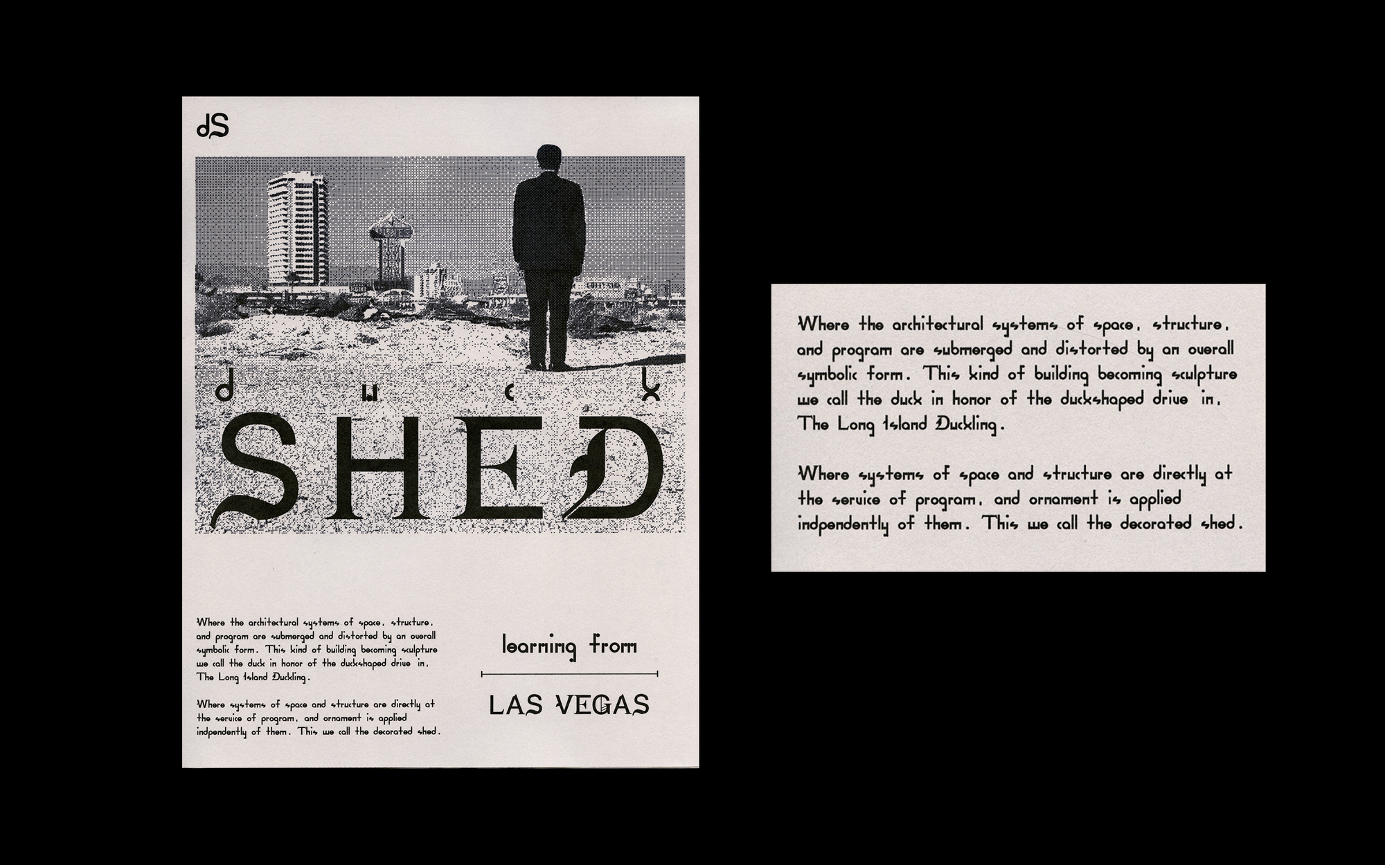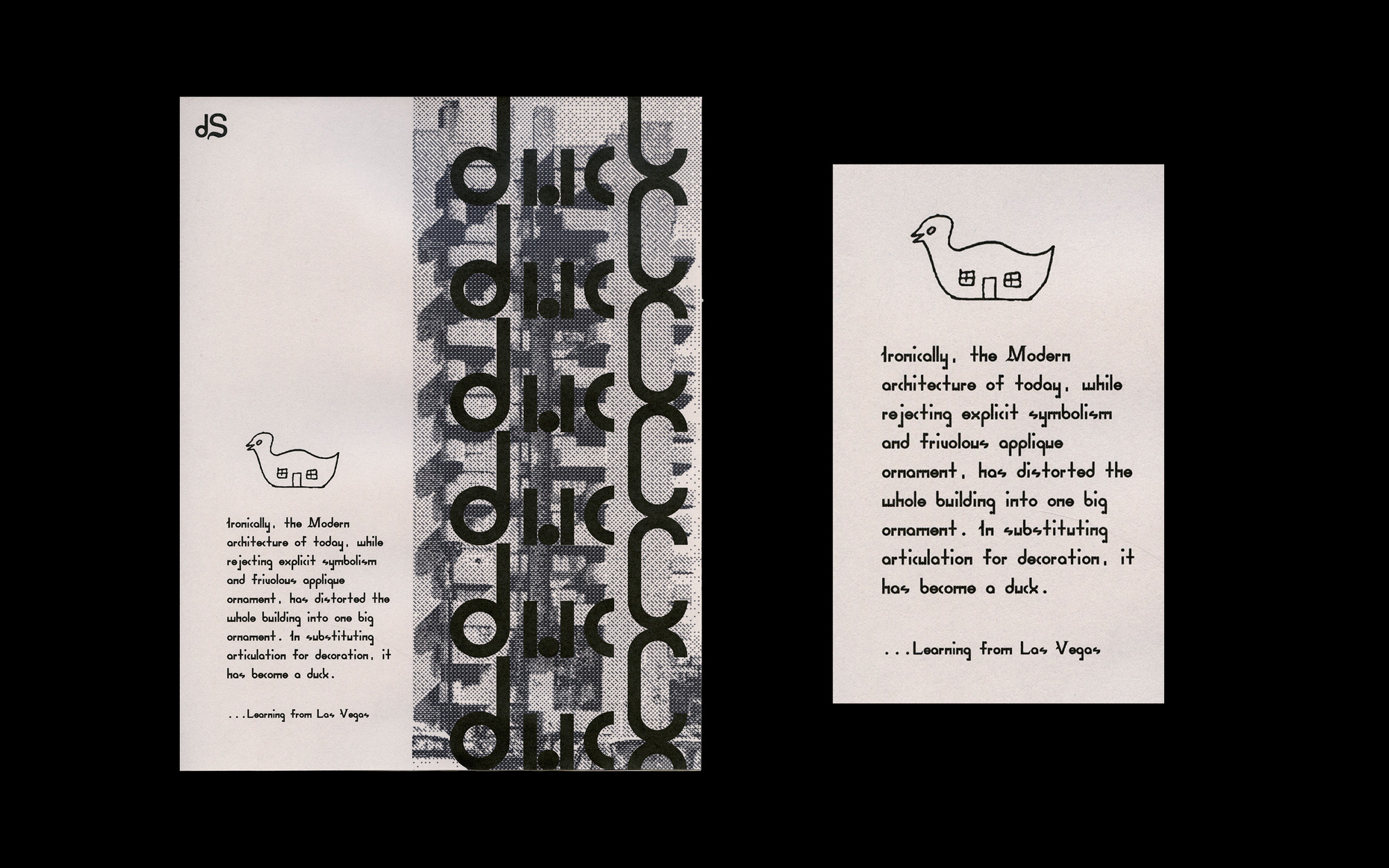
Duck Shed Font
A font paying homage to Learning from Las Vegas, and its infamous critique of modernist architecture
- Type Design
- Inkjet Print
- 2021

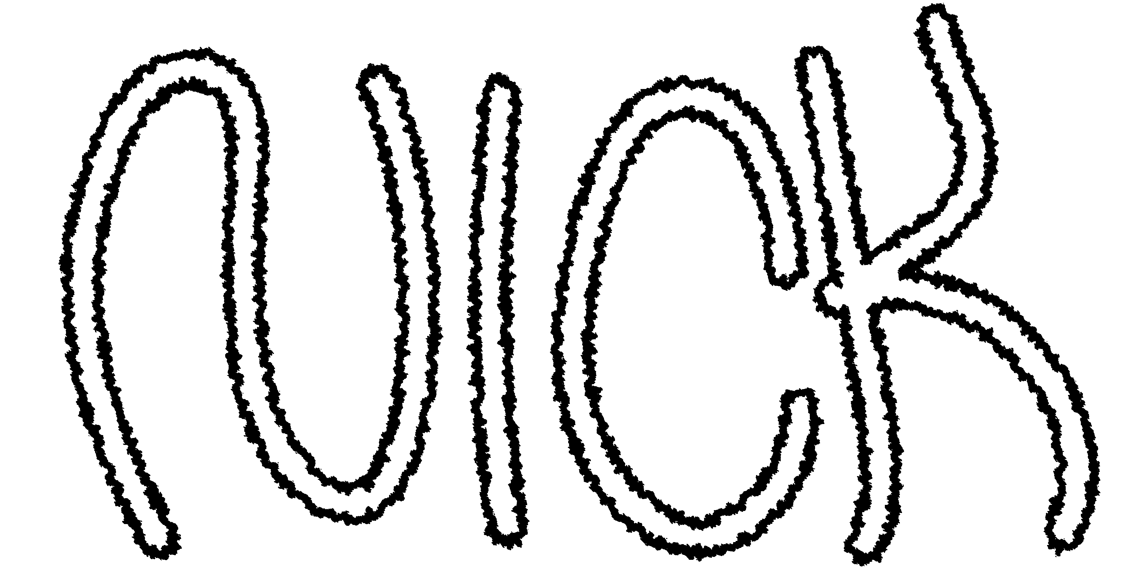
Duck Shed is a font inspired by Roger Venturi and Denise Scott Brown’s seminal postmodern critique of modernist architecture: Learning from Las Vegas. The typeface is emblematic of the Duck/Decorated Shed analogy offered in the book and split into two sections (lowercase and caps) to articulate and exaggerate the difference between the “Duck” and the “Decorated Shed”.
The “duck” adheres strictly to an overly rigid, modular, geometric system. In doing so the typeface loses legibility and functionality, highlighting the inflexibility of modernist design. By rejecting ornament in hopes of heroic originality, it becomes a parody of modernist sensibilities. On the other hand, “shed” implements the strategy of applying ornament onto an ordinary structure. To accomplish this I attached calligraphic elements onto a functional sans serif, articulating the glyph to the viewer through symbolic connotation.